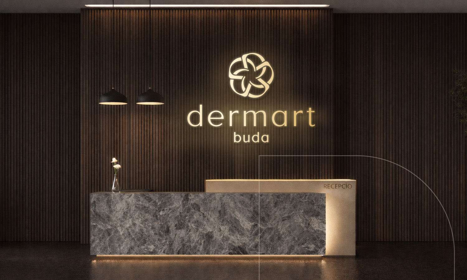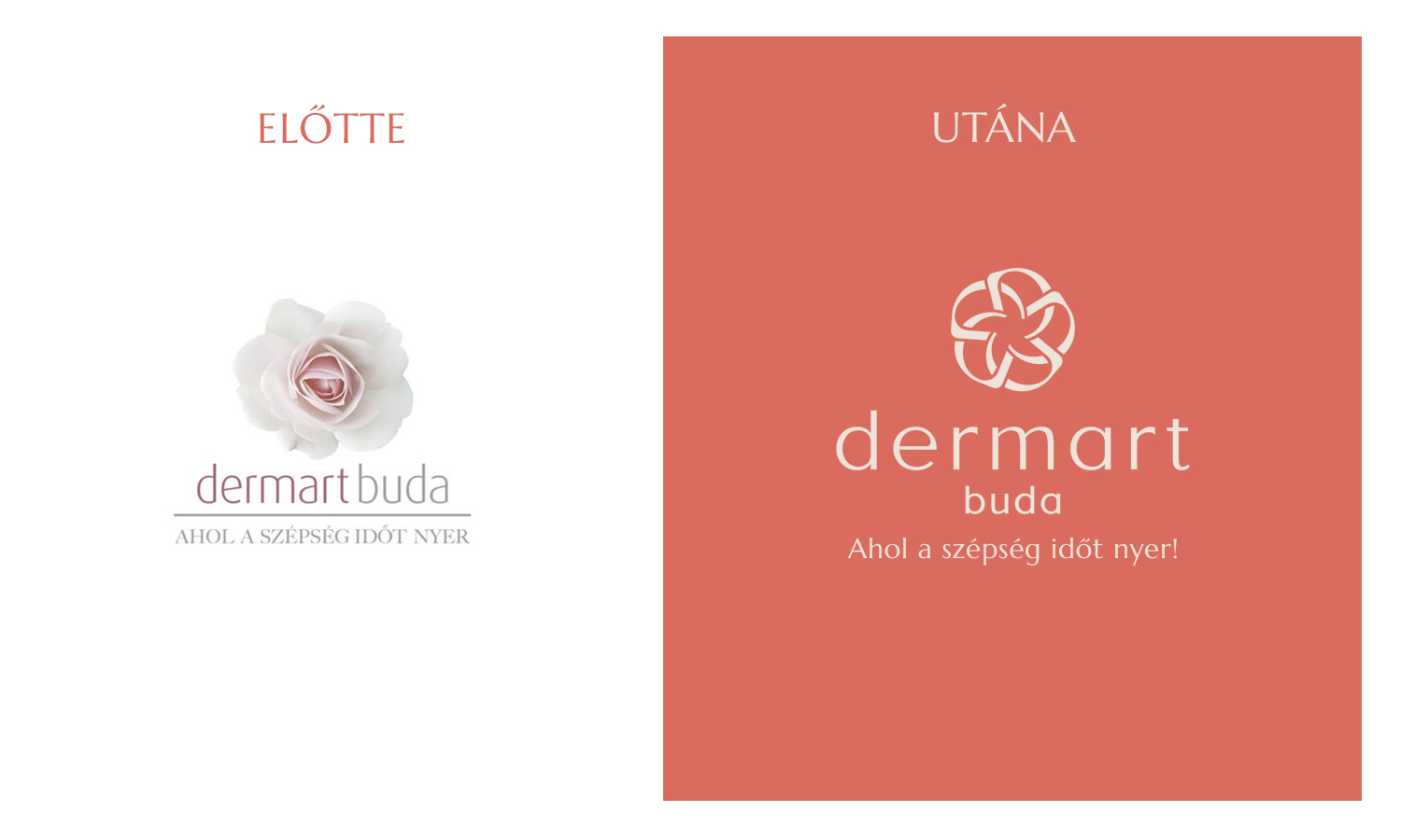
The logo redesign of Dermart Buda Clinic represents a visual evolution that preserves the brand’s core values and recognizability while providing a more contemporary, refined, and premium appearance.
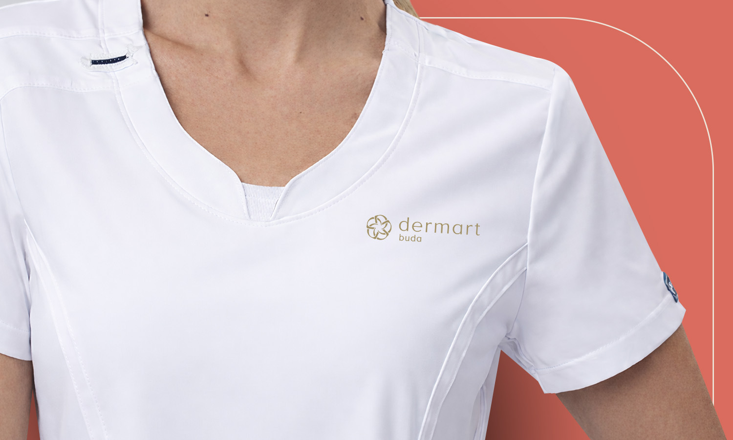
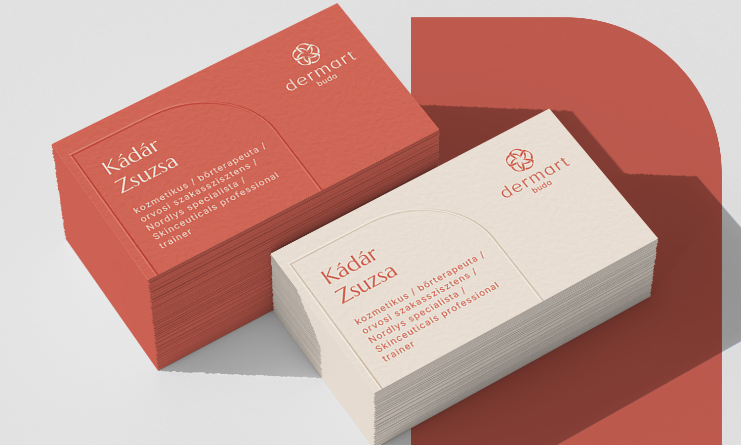
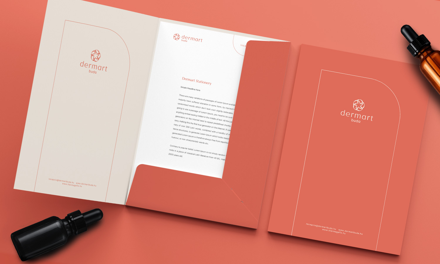
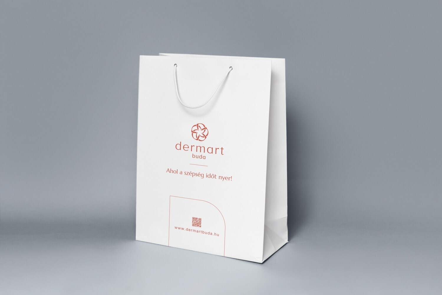
The central motif – five interwoven “D” letters – conveys new meaning while subtly referencing the playfulness of the former floral symbol. The organic connection of the letters symbolizes the complex yet harmonious operation of the clinic’s services: the unity of dermatology, aesthetics, technology, expertise, and personalized care. In this way, the redesign does not sever ties with the past but thoughtfully builds upon it.
The refinement of proportions and the clarification of typography have resulted in an elegant visual identity that is competitive on an international level. The renewed logo faithfully reflects the clinic’s philosophy: understated, professionally grounded, and personalized aesthetic solutions – aligned with a vision of becoming Hungary’s leading aesthetic center.
Client: Dermart Buda Clinic
Year of project: 2025
Creative: OPen Group
Kategóriák
Képzőművészet
Iparművészet
Formatervezés
Képgrafika
Tervezőgrafika
Mockup
Multimédia
Építészet
Reklám