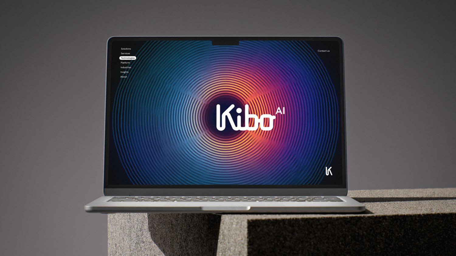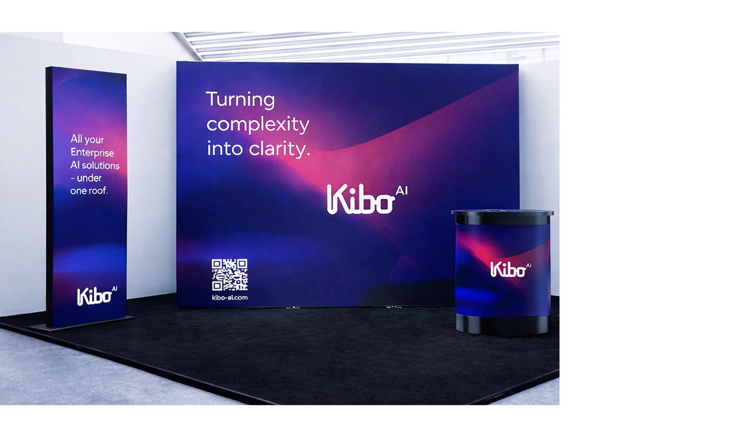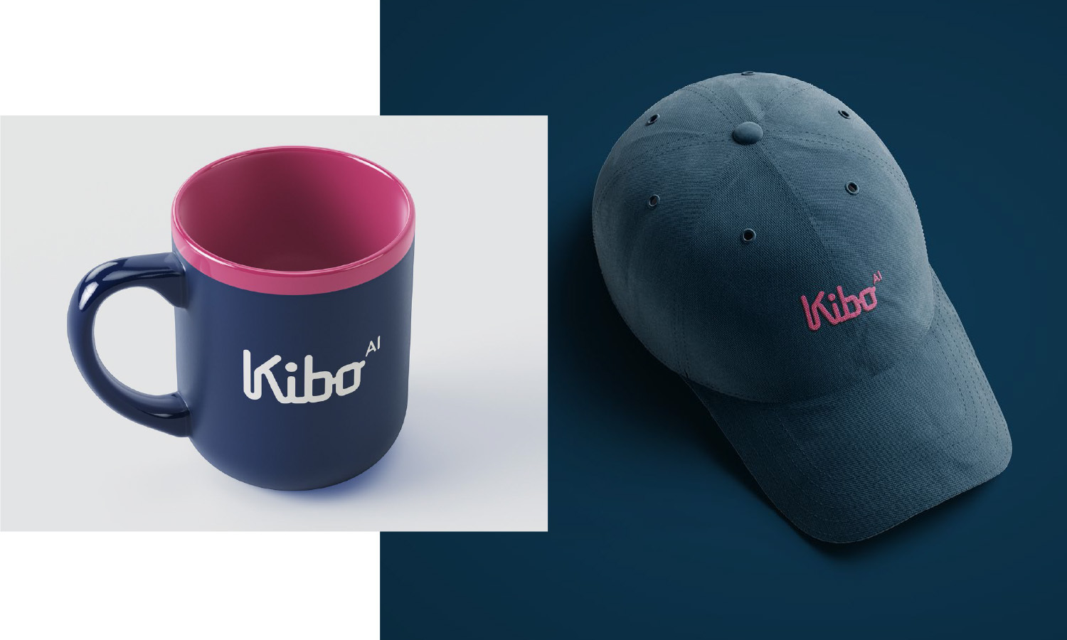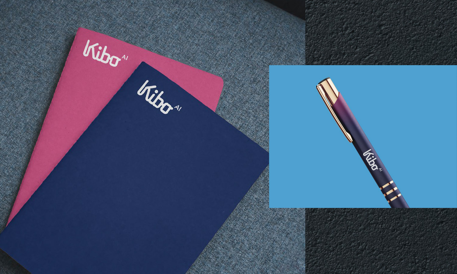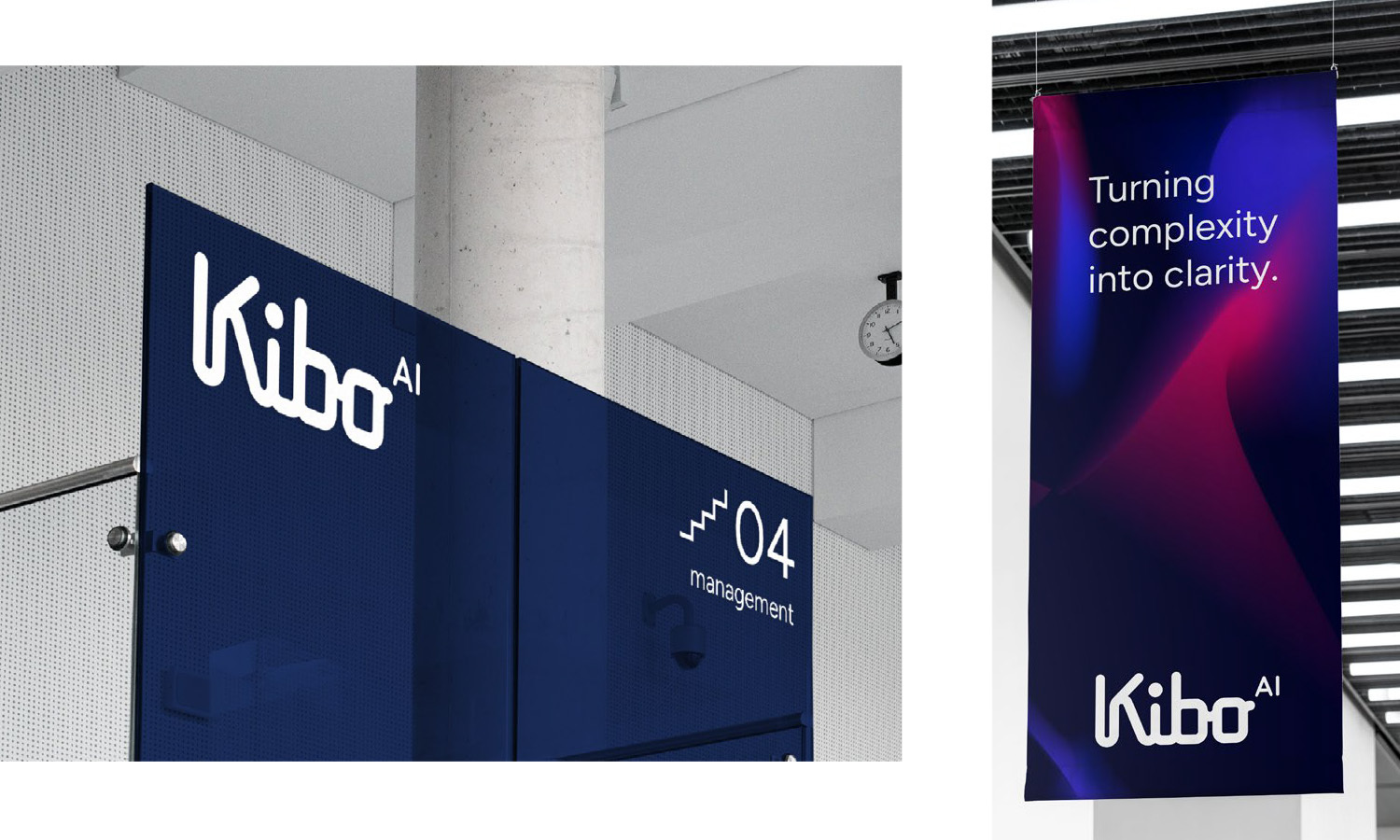
The Kibo AI brand identity is built around a clear visual metaphor: a path. The logo represents the journey their clients take in navigating complex data environments and AI-driven decision-making — a journey in which Kibo acts as a strategic guide.
The dynamic yet clean form language symbolizes direction, progress, and continuous support. The path motif communicates clarity within complexity, reinforcing the brand’s role as a trusted navigator in a rapidly evolving technological landscape. The color system is aligned with this concept: modern, forward-looking tech-savvy tones that evoke innovation, precision, and reliability.
Together, the logo and visual identity establish Kibo AI as a confident, intelligent partner helping organizations move forward with clarity and control.
Client: Kibo AI
Year of project: 2025
Creative: OPen Group