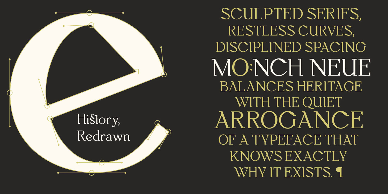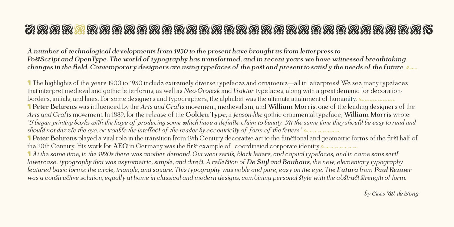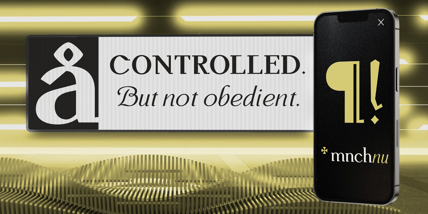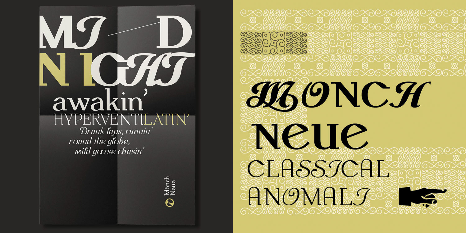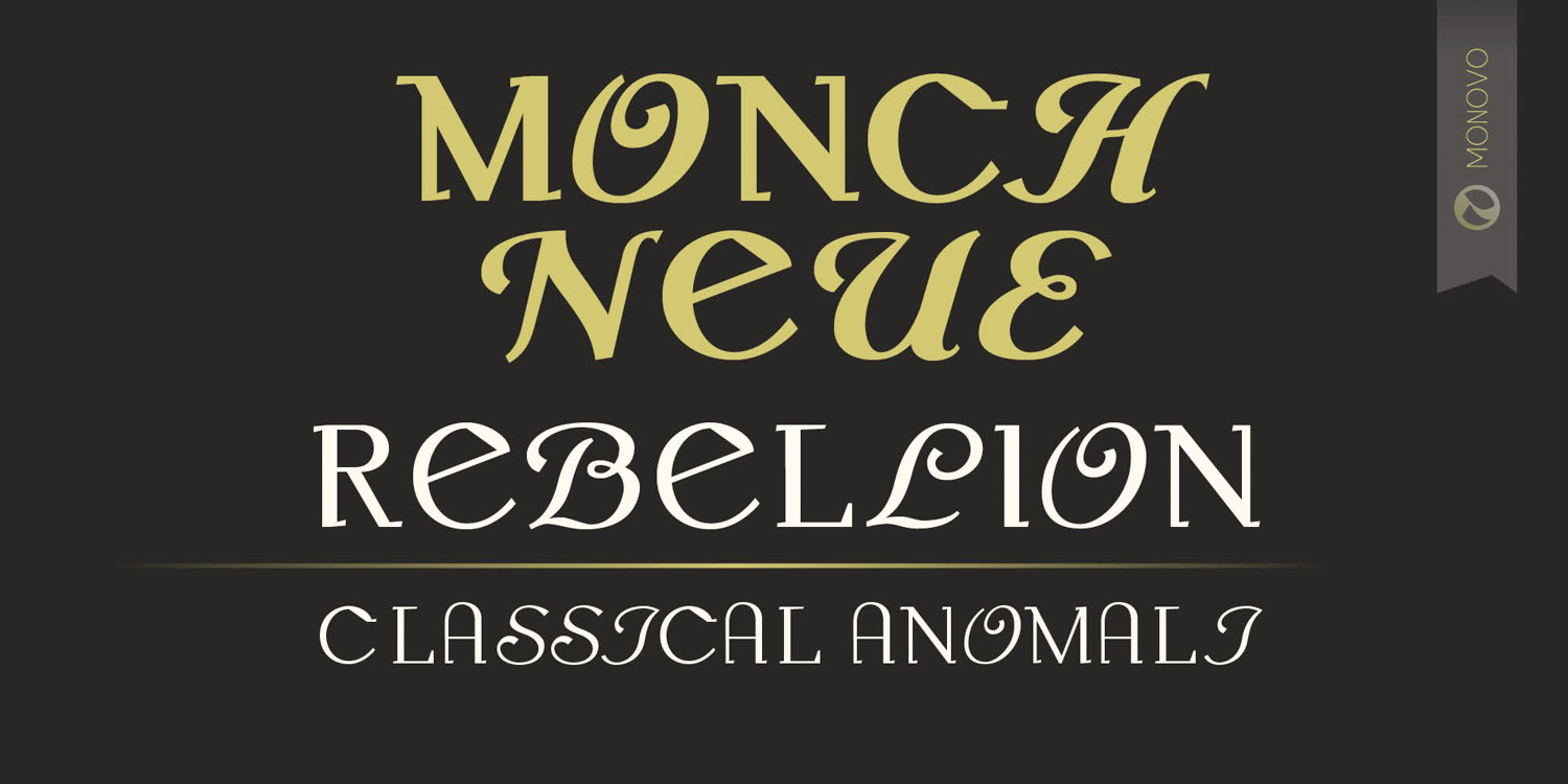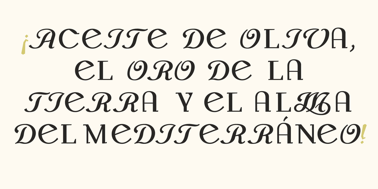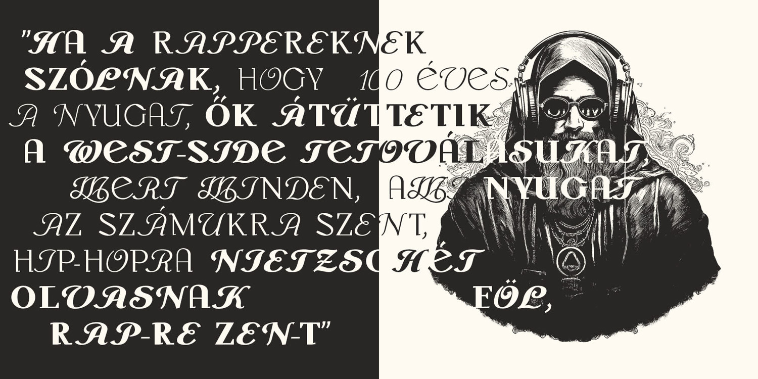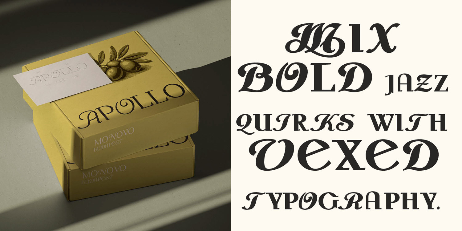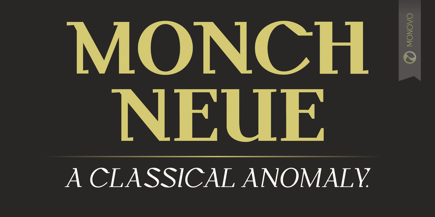
History, Redrawn. The story behind Mönch Neue European typography at the turn of the twentieth century was caught between two worlds. The nineteenth century had given us ornament, revival styles, elaborate printing traditions—everything dense, everything decorative. But the new century wanted something else. Not a rejection of history, exactly. Just... a different conversation with it. Two typefaces appeared within a few years of each other, each with its own temperament. Peter Behrens released Behrens Antiqua in 1907. An architect designing letters—which shows. The forms feel constructed rather than written. Curves are slightly restless. Terminals sculptural. Proportions subtly off in ways that shouldn't work but do. It sits somewhere between classical Roman structure and the expressive energy of early modernism, refusing to pick a side. Behrens himself was operating at a strange cultural moment. His work for AEG—often cited as one of the first coherent corporate identity systems—happened before the term "corporate identity" even existed. Behrens Antiqua reflects that transitional thinking: typography beginning to participate in something larger than the printed page. Five years later, Anton Durstmüller designed Mönch Antiqua in 1912. Where Behrens leaned theatrical, Durstmüller stayed composed. Calmer proportions. Disciplined rhythm. A typeface comfortable with the traditions of book typography, not fighting them. The contrast between the two designs is what makes them interesting. One carries the energy of artistic experimentation. The other reflects classical restraint. Both belong to the same cultural moment. Both respond to it completely differently. Mönch Neue started with a question: What happens if you put these two voices in the same room? Not reconstruction. Not revival in the usual sense. Instead: studying both, redrawing both, synthesizing elements from each into something that didn't exist before. The sculptural energy of Behrens' letterforms meets the steadier rhythm of Durstmüller's Mönch. Curves recalibrated. Terminals refined. Spacing rebalanced. The goal wasn't historical accuracy—it was translation. Taking structural ideas from early twentieth-century designs and making them function now, in editorial work, branding systems, and identity projects that need typographic depth without visual noise. The result balances two seemingly incompatible attitudes: expressive form and classical discipline. You can still see traces of the historical roots—tension in certain curves, sculptural details in the serifs—but Mönch Neue isn't nostalgic. It's a contemporary structure built from historical fragments. A recomposition, not a reproduction. Typography evolves through such dialogues with the past. Each generation revisits earlier forms, studies their logic, and reshapes them for new conditions. Mönch Neue continues that tradition—not by preserving history unchanged, but by redrawing it. Which feels right. History isn't something you photocopy. It's something you argue with.
Kategóriák
Képzőművészet
Iparművészet
Formatervezés
Képgrafika
Tervezőgrafika
Mockup
Multimédia
Építészet
Reklám